 [image via PICTOLINE. All rights reserved.]
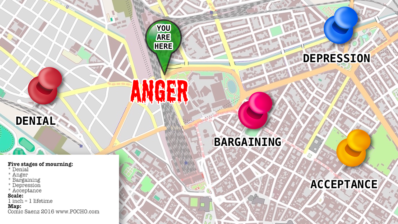
Here’s another one:
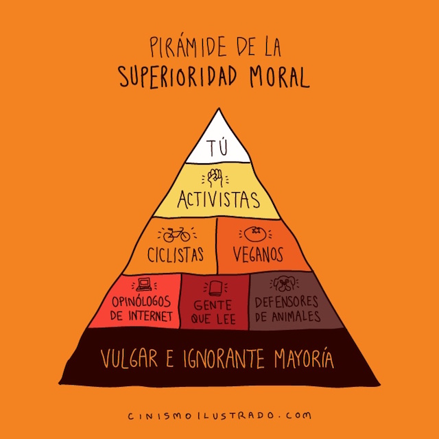
Mas…Infographics: Pyramid of moral superiority, world tragedy map
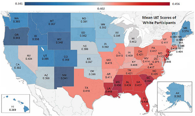 Most white Americans are biased against blacks, but it differs across the country. In this map, the redder the state, the higher the hate. Michigan, in gray, is in middle, bias-wise, and the bluer states are less biased than Michigan.
There’s some tricky methodology involved, and there may be some “selection bias,” but if anything, the survey results may underestimate the prejudice.
Here’s The Washington Post Wonk Blog report:
Mas…White Americans are biased against blacks, and some more than others
 More toons like this @ Coolness Graphed.
 DA FUQ? SMH! [Image by Scott Bateman via The Nib Comics.]
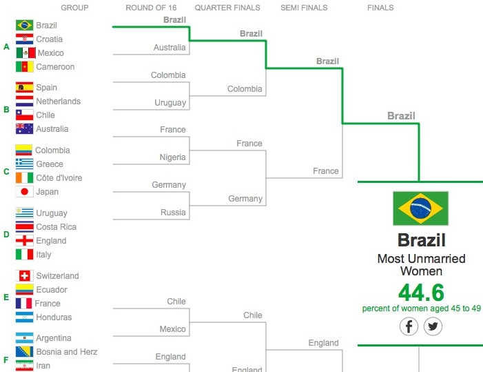
If there were a World Cup for the Highest Percentage of Middle-Aged Unmarried Women Between 45 and 49, Brazil would win! ¡Ole!
In the World Cup for the Futbol Team with the Most Twitter Followers, the winner is Selección Mexicana, @miseleccionmx on the Tuiter:
Mas…Everyone wins a World Cup of Everything Else (infographics)
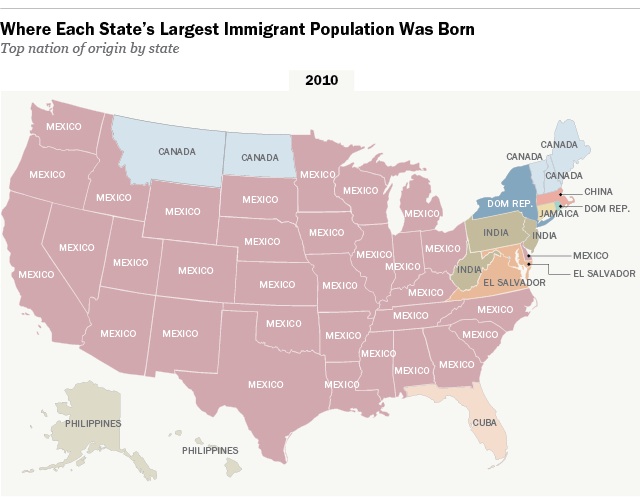 These days in Aztlan — and across lots of the United Estates — most immigrants come from Mexico, but it wasn’t always that way. A hundred years ago or so they were from Germany.
The Pew Research Center reports:
Mas…Where do immigrants come from? These days, the answer is ‘Mexico’
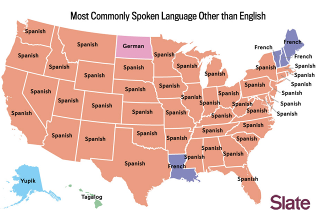
Slate’s infographic mapping magic illustrates what we knew already — across most of the United Estates, Spanish is almost always the most commonly-spoken language besides English.
But after English and Spanish, what’s Numero Tres? Here in California, it’s Tagalog, first language of a quarter of all Filipinos and the second language of most. Pinoys, ruled by both Spain and the U.S., are the honorary (?) Latinos of Asia.
Tagalog? If you’ve got cooties, or play with a yo-yo, or live in the boondocks, you’re speaking Tagalog.
There are also unexpected results in Texas and Florida and New York and Illinois and…. Here’s the spoken language third place map:
Mas…Shoutout to the Pinoys and Yo-Yos of Califas: You’re #3 (infographic)
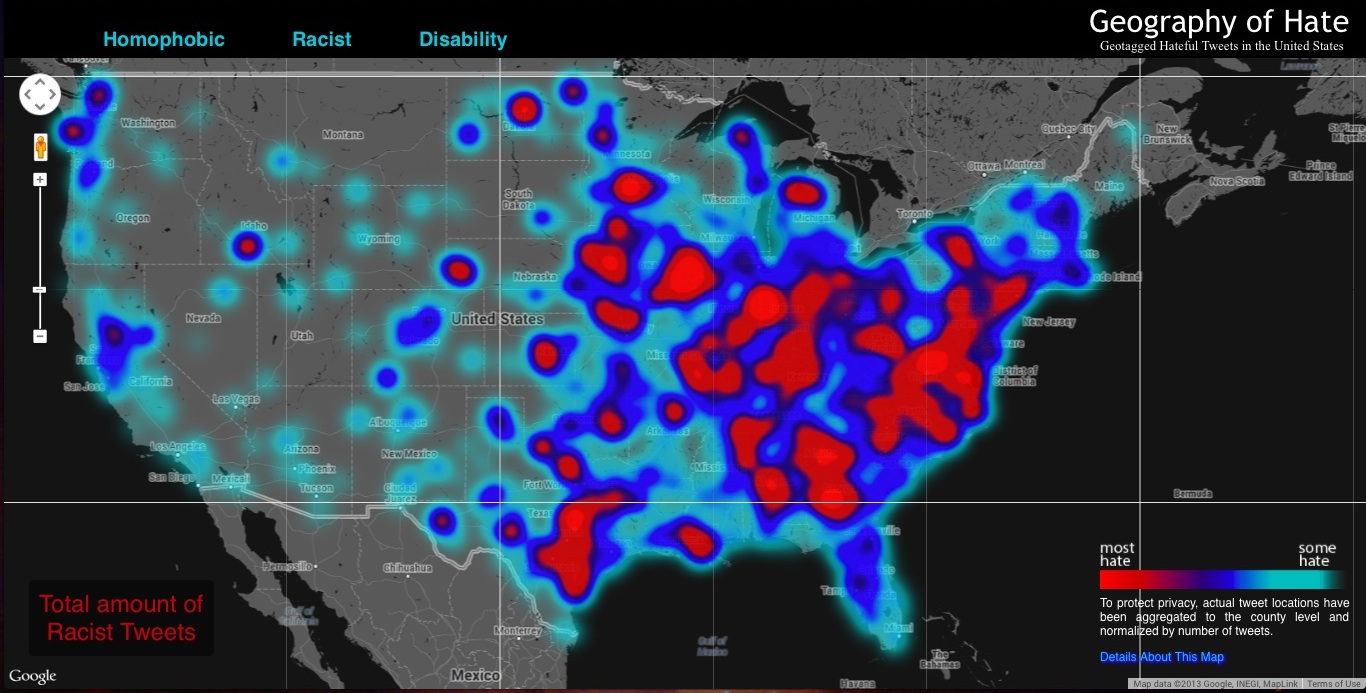 The infographic map-heads at FloatingSheep.org analyzed geo-tagged Tweets from one week in November last year to generate a hate map of the U.S.
Surprise, surprise — the Old Confederacy had the most haters when slurs about Latinos (Tweets using the word “wetback” and “spick”), African-Americans (“nigger”), Asians (“chink,” “gook”) were tallied (pan-racist map, above.) [Click maps to enlarge.]
Here’s the breakdown of “wetback” Tweets:
Mas…Haters Gonna Hate: Big map of racist/hateful Tweets (infographic)
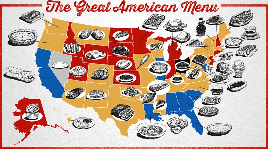 Here’s an idea. Let’s decide what is the best food in each of the United Estates and make a big infographic.
What? Is that the voice of (Day of the) Dead Steve Jobs? What’s that, Steve? There’s a map for that?
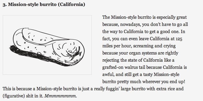
Coming in at Numero Tres is a puro Califas burrito, known to non-locals as a “Misson Burrito.” Yes, I’m on a mission — I want a carne asada burrito ahorita:
New Mexico gets in the Top Ten with a stacked enchilada with green (Hatch, natch) chile:
Mas…There’s a map for that: Best foods in every state (infographic)
 Every country in the world has to be Numero Uno in something, right? These maps have the surprising details:
Mas…World Map: Every country is #1 in something (infographic)

Google or Feisbuk? This cool infographic from the people at Information Geographies at the Oxford Internet Institute shows which website is most popular in each country in the Western Hemisphere. It looks like Cuba is still hanging out on MySpace.
Here’s the full world map:
Mas…Where the clicks are: Top websites by country (infographic)

It’s no secret that Americans love Mexican food — Gustavo ¡Ask A Mexican! Arellano’s book Taco USA celebrated that aspect of the Reconquista last year.
But not all of the United Estates is created equal, and in some areas of the country there is a shocking Mexican restaurant shortage!
There are more Mexican restaurants than Italian bistros, Chinese kitchens, chicken rotisseries, or seafood shacks in the US. We’re talking about no less than 38,000 Mexican restaurants dispersed all across the American landscape (as of 2011).
Mas…How does your state rate in the Mexican restaurant wars?