map
Tamal Tuesday: How many types of tamales have you tasted?
[Image via PICTOLINE. All rights reserved.]
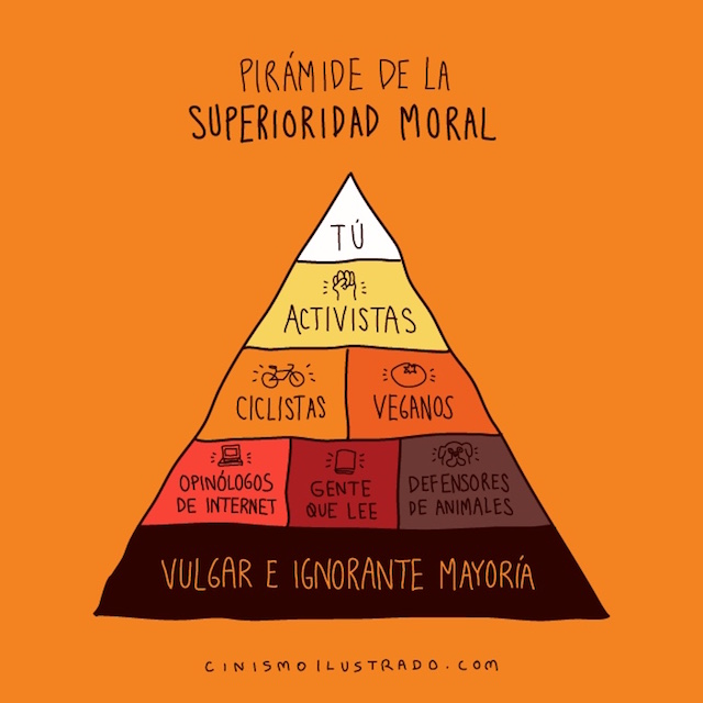
Infographics: Pyramid of moral superiority, world tragedy map
Here’s another one:
Mas…Infographics: Pyramid of moral superiority, world tragedy map
Where to get tacos? In Mexico, there’s an app for that (video)
Don’t spent another Taco Tuesday lost in Mexico, dazed and confused about where to grab a bite. Taco Guru has an app for that.
In Mexico City? Google Transit will tell you where to go (video)
 When in Mexico City, do like the Mexican Citians do — with Google Maps.
Mas…In Mexico City? Google Transit will tell you where to go (video)
White Americans are biased against blacks, and some more than others
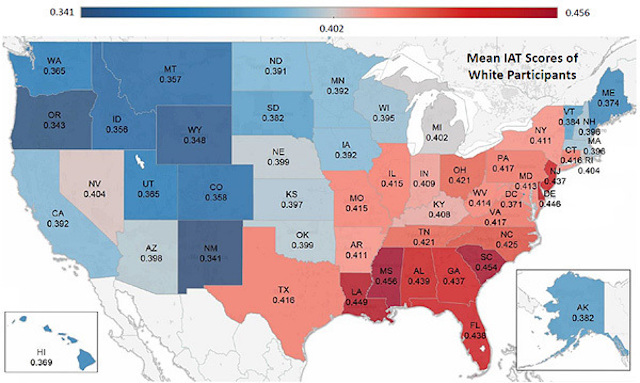 Most white Americans are biased against blacks, but it differs across the country. In this map, the redder the state, the higher the hate. Michigan, in gray, is in middle, bias-wise, and the bluer states are less biased than Michigan.
There’s some tricky methodology involved, and there may be some “selection bias,” but if anything, the survey results may underestimate the prejudice.
Here’s The Washington Post Wonk Blog report:
Mas…White Americans are biased against blacks, and some more than others
Breaking Ñews: Map shows common Asian languages by state
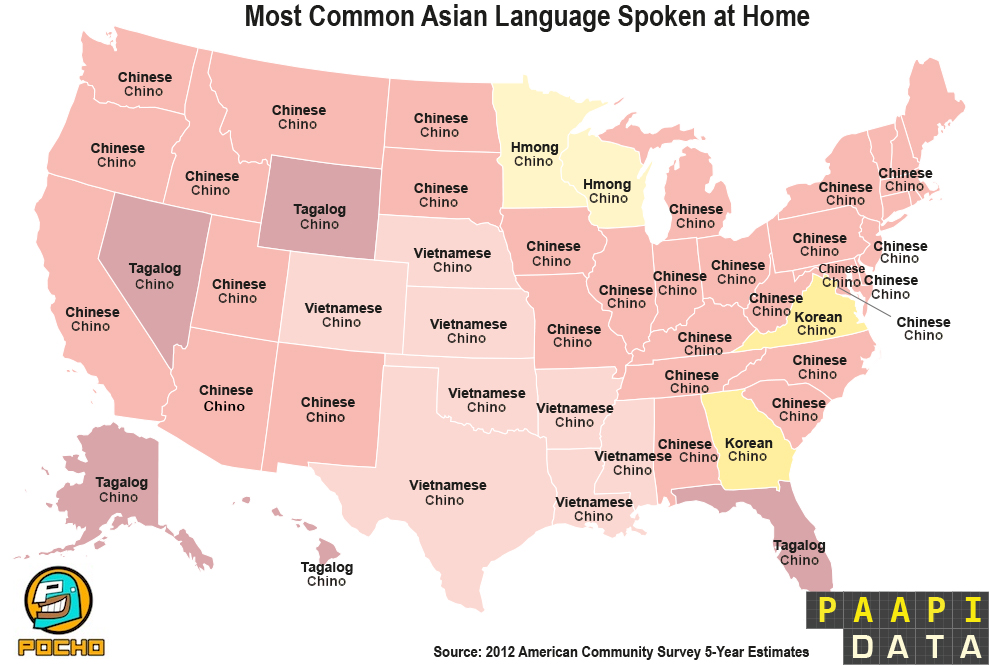 (PNS reporting from NORMAL, ILL) Demographers at Pocho Asian American Policy Institute (PAAPI) here have just released a new map detailing the most common Asian languages spoken in the U.S., broken out on a state by state basis, in English and Spanish. [Click on image to enlarge.]
Mas…Breaking Ñews: Map shows common Asian languages by state
Where do immigrants come from? These days, the answer is ‘Mexico’
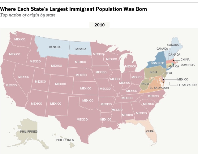 These days in Aztlan — and across lots of the United Estates — most immigrants come from Mexico, but it wasn’t always that way. A hundred years ago or so they were from Germany.
The Pew Research Center reports:
Mas…Where do immigrants come from? These days, the answer is ‘Mexico’
Shoutout to the Pinoys and Yo-Yos of Califas: You’re #3 (infographic)
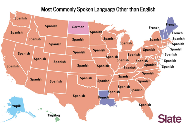
Slate’s infographic mapping magic illustrates what we knew already — across most of the United Estates, Spanish is almost always the most commonly-spoken language besides English.
But after English and Spanish, what’s Numero Tres? Here in California, it’s Tagalog, first language of a quarter of all Filipinos and the second language of most. Pinoys, ruled by both Spain and the U.S., are the honorary (?) Latinos of Asia.
Tagalog? If you’ve got cooties, or play with a yo-yo, or live in the boondocks, you’re speaking Tagalog.
There are also unexpected results in Texas and Florida and New York and Illinois and…. Here’s the spoken language third place map:
Mas…Shoutout to the Pinoys and Yo-Yos of Califas: You’re #3 (infographic)
We’re Number One! California leads nation in active hate groups
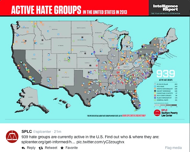 The Golden State leads in nation in the number of active hate groups, according to the Southern Poverty Law Center.
California hosts 77 hate orgs, the report said. Florida was second with 58 groups of haters, and Texas placed third with 57.
Mas…We’re Number One! California leads nation in active hate groups
Screw Dora the Explorer and her pinche monkey too
 I’ve got a problem with Dora the Explorer. I know you do too.
What the hell is the matter with television’s longest running bilingual toon whore?
This passive-aggressive little cow yells too much.
She asks a question, then waits silently for the answer while staring at you like a creep. I swear she can see me through the TV screen!
This unemployed bitch has been on air for almost 13 years now and she hasn’t figured out why her backpack is on acid and why her pet monkey stole her boots.
Ask the monkey, it fucking talks, dumbass!
Haters Gonna Hate: Big map of racist/hateful Tweets (infographic)
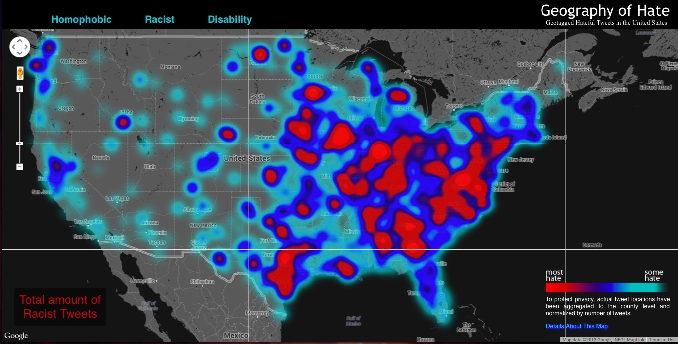 The infographic map-heads at FloatingSheep.org analyzed geo-tagged Tweets from one week in November last year to generate a hate map of the U.S.
Surprise, surprise — the Old Confederacy had the most haters when slurs about Latinos (Tweets using the word “wetback” and “spick”), African-Americans (“nigger”), Asians (“chink,” “gook”) were tallied (pan-racist map, above.) [Click maps to enlarge.]
Here’s the breakdown of “wetback” Tweets:
Mas…Haters Gonna Hate: Big map of racist/hateful Tweets (infographic)
World Map: Every country is #1 in something (infographic)
![]() Every country in the world has to be Numero Uno in something, right? These maps have the surprising details:
Every country in the world has to be Numero Uno in something, right? These maps have the surprising details:
Mas…World Map: Every country is #1 in something (infographic)
Where the clicks are: Top websites by country (infographic)

Google or Feisbuk? This cool infographic from the people at Information Geographies at the Oxford Internet Institute shows which website is most popular in each country in the Western Hemisphere. It looks like Cuba is still hanging out on MySpace.
Here’s the full world map:
Mas…Where the clicks are: Top websites by country (infographic)
POCHO History 101: Actual European ‘discoveries’ in one handy map
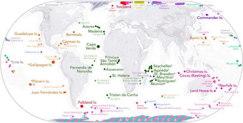
All that stuff they teach in history about Europe’s so-called Age of Discovery turns out to be Eurocentric racist mythmaking, once you subtract places that couldn’t be “discovered” because there were already humans living there.
Mas…POCHO History 101: Actual European ‘discoveries’ in one handy map


